Property Investment Platform - Redesign
UX/UI redesign of a UK property investment web app. As Product Designer, I owned the end-to-end redesign to fix information architecture and usability issues across core investment journeys in a regulated context.
project type
Commercial
Industry
Fintech
Role
Product (UX/UI) Designer
Date
Sep - Oct 2019
Top summary (TL;DR)
Role: Product (UX/UI) Designer (discovery → handoff)
Goal: Make core investment tasks easy to find and complete in a regulated context
Users: New investors + existing investors managing portfolio and wallet actions
Key changes: Rebuilt navigation/IA, clarified task-first page structures, standardised CTAs and interaction patterns
Outputs: Audit + benchmarking, IA testing (tree test + card sort), wireframes → hi-fi, functional spec for handoff
Proof: Audit findings, IA test results (success rates + misclicks), before/after navigation + key screens
Business signal: Redesign supported improved task completion and reduced navigation friction in core investment journeys (validated through IA testing and stakeholder review)

Problem
The existing property investment platform made it difficult for users to understand where to start, what actions were available, and how to progress through key investment tasks. Navigation and information architecture did not reflect user mental models, while page layouts prioritised marketing content over task completion.
In a regulated financial context, this lack of structural clarity reduced confidence at critical decision points and increased friction across core investment journeys.
Key problems identified
Primary investment tasks were difficult to locate
Navigation labels and hierarchy lacked clarity
Content obscured next steps and decision points
Page structures were inconsistent across key journeys
Solution
The redesign focused on improving task clarity, structural consistency, and alignment between user goals and business requirements. Using research and audit findings, the platform was restructured to surface core investment journeys, simplify navigation, and present information in a clearer, more predictable way while accommodating regulatory constraints.
Rather than applying a visual refresh, the work prioritised structural change to support confident decision-making and progression through key tasks.
Key changes delivered
Reworked the information architecture to surface core investment and portfolio tasks at the top level
Separated task-driven investment journeys from marketing and explanatory content
Introduced consistent page structures for investment listings and investment detail pages
Standardised interaction patterns and CTA placement to support confident progression
Impact (post-redesign indicators)
While this work was delivered within a short engagement and did not include long-term analytics tracking, early validation and stakeholder review indicated clear improvements:
Reduced time to locate core investment tasks (properties, portfolio, wallet actions) during testing and walkthroughs
Fewer navigation dead-ends caused by duplicated or unclear labels
Improved confidence at decision points by separating marketing content from transactional flows
Clearer distinction between investing, managing investments, and account actions
Stakeholders confirmed the revised structure better reflected user intent and reduced reliance on explanatory content during onboarding and support conversations.
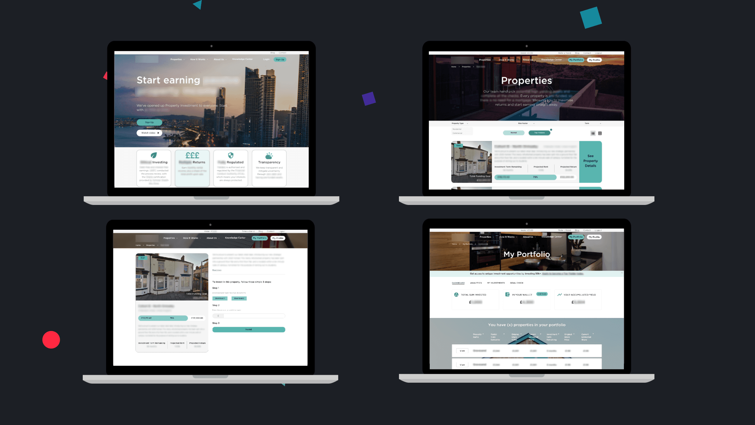

High-fidelity screens supporting core investment and portfolio tasks.

Gantt chart showing UX activities across the delivery timeline.
1 . Discovery and alignment
1.1
UX Questionnaire
An initial UX Questionnaire was run at the start of the project to establish a shared understanding of the product, its users, and the outcomes the platform needed to support. This helped surface assumptions early and align stakeholders before any audit or design work began.
The session focused on clarifying the value proposition, identifying primary user groups, and agreeing the core user tasks the platform should prioritise, including browsing investment opportunities, committing funds, and tracking portfolio performance. Constraints relating to regulation, delivery timelines, and technical complexity were also discussed.
Responses were captured collaboratively using a shared board, allowing gaps and inconsistencies in understanding to be identified. The outputs of this exercise were used to shape the focus of the UX audit, define the scope of subsequent research, and prioritise the user journeys addressed in the redesign.
This alignment work defined which investment journeys the redesign would prioritise and which areas were intentionally deprioritised due to time and regulatory constraints.

Early alignment exercise used to define product intent and priority user tasks.
2 . UX Audit & Heuristic Evaluation
2.1
Establishing a usability baseline and priority issues
A UX audit was conducted to assess the quality of the existing platform and identify usability issues affecting key investment journeys. The review focused on navigation, information architecture, content clarity, and interaction patterns, supported by a heuristic evaluation against recognised usability principles.
The audit showed that navigation and information architecture were the weakest areas. Key tasks were difficult to locate, page hierarchies were inconsistent, and content often prioritised marketing messages over task progression. Multiple usability principles were breached simultaneously on critical pages, contributing to friction and user drop-off.
What this meant for the redesign
Navigation labels needed to reflect user intent rather than internal terminology
Core investment tasks had to be accessible without relying on explanatory content
Structural consistency mattered more than visual refinement
Findings from the audit were used to establish a clear baseline and prioritise areas for improvement. This work directly informed the scope of the strategy workshop, the focus of IA testing, and the journeys addressed during design.

Audit findings highlighting priority usability and structural issues.
2.2
Comparative Assessment
A comparative assessment was carried out to understand how similar property investment platforms structure key journeys and communicate value, risk, and credibility. The review focused on direct competitors operating in the same regulated space, using a consistent set of criteria to reduce subjectivity.
Platforms were compared across tone of voice, navigation structure, content hierarchy, and the presentation of investment information. This highlighted clear trade-offs between approachability and perceived credibility, as well as recurring usability issues such as cluttered layouts, inconsistent navigation naming, and repeated calls to action.
Insights from this work informed structural and content decisions rather than visual styling. In particular, it reinforced the need for clearer task prioritisation, more scannable content, and navigation labels that aligned with user expectations rather than internal terminology.


Selection of competitor platforms reviewed to benchmark structure, tone, and task patterns.
3 . Strategy and structure definition
3.1
UX Strategy Workshop
A UX strategy workshop was run to bring together findings from discovery, the audit, and the comparative assessment, and to validate priorities with the wider team. The session created space for stakeholders to review the existing experience, share domain knowledge, and agree where change would have the most impact.
Participants reviewed key pages and journeys, highlighting issues related to navigation, content clarity, and task flow. They were encouraged to flag areas of friction, identify gaps in the current experience, and suggest features or improvements based on their understanding of user and business needs.
The workshop outputs were used to synthesise insights and define a clear experience direction. This helped align the team on focus areas ahead of information architecture testing and interaction design, reducing the risk of misalignment later in the project.


Stakeholder workshop used to validate priorities and agree experience direction.
3.2
Information Architecture: Sitemap Testing
To validate whether the existing sitemap supported user understanding and task completion, information architecture testing was carried out with both new and existing users.
Tree testing showed that new users struggled to locate key information, with only 56% of tasks completed successfully, particularly around the client’s process and ethical credentials. Existing users performed better overall but still showed confusion when navigating portfolio performance and wallet actions, indicating unclear grouping and labelling.
An open card sorting exercise was then used to understand how participants naturally grouped content, independent of the existing structure. This highlighted clear misalignment between the current sitemap and user mental models, especially around process-related content and account-level actions.
These findings informed a revised sitemap with clearer task-based groupings, reduced duplication, and more predictable naming. Two alternative structures were produced and reviewed with stakeholders before agreeing a single direction.
Resulting structural decisions
Renamed and regrouped top-level navigation to reflect user intent
Separated investing from account and portfolio management
Grouped wallet, returns, and investments into a single task-based area
Moved process, fees, and risk content out of core journeys
Clarified where users could start investing versus manage existing investments
This restructuring aligned navigation with user expectations and reduced friction across core investment journeys.


Existing sitemap, IA testing outputs, and revised sitemap showing the evolution of the navigation structure.
4 . Interaction and interface design
4.1
Sketches
Following the definition of the revised information architecture, sketching was used to explore layout options and interaction patterns for key pages. This stage focused on translating structural decisions into page-level flows before committing to wireframes.
Multiple sketch variations were produced for each key page, prioritising clarity of task order, hierarchy, and progression over visual detail. This allowed different approaches to be compared quickly and helped surface potential issues early, particularly around how investment options and portfolio information were presented.
Insights from this work were used to identify consistent layout patterns and inform the structure of subsequent wireframes.


Early layout exploration used to translate structural decisions into page-level flows.
4.2
Mid-Fidelity Wireframes
Mid-fidelity wireframes were created to define page structure, interaction patterns, and content hierarchy in more detail, while remaining visually neutral. This allowed the focus to stay on usability and task completion rather than styling.
The wireframes covered key journeys including browsing available properties, reviewing individual investment opportunities, and tracking portfolio performance. Regular review sessions were held with stakeholders to validate assumptions, gather feedback, and iterate on the designs as requirements evolved.
This stage helped resolve questions around layout consistency, navigation behaviour, and information density ahead of visual design. By the end of this phase, the core interaction model for the platform had been agreed.


4.3
High-Fidelity Wireframes
High-fidelity wireframes were produced to apply visual hierarchy, branding, and responsive behaviour to the validated layouts. This stage focused on reinforcing task priority and clarity while accommodating regulatory content and disclosures.
Design work covered desktop and mobile views, ensuring that core journeys such as browsing investments, reviewing details, and monitoring portfolio performance remained clear across breakpoints. Interaction states and content emphasis were refined through ongoing stakeholder review.
The high-fidelity designs consolidated earlier decisions rather than introducing new concepts. This helped reduce risk ahead of handoff and ensured the interface supported the agreed experience direction.


Wireframes used to define structure, interaction, and content hierarchy ahead of visual design.
5 . Developer handoff
5.1
Handoff
Designs were prepared for handoff with a focus on clarity and implementation support. Final screens were uploaded to a shared handoff tool, supported by a functional specification outlining interaction behaviour, content rules, and edge cases.
A walkthrough session was held with developers to review key journeys, priorities, and constraints. This helped surface questions early and reduce ambiguity before build work began.
Post-handoff support was provided to clarify design intent and respond to implementation queries as needed, helping maintain alignment through delivery.
Designs were supported by documented interaction behaviour, content rules, and edge cases to reduce ambiguity during build.
6 . Final outcome
The redesign clarified how users could start investing, understand opportunities, and track their portfolio within a regulated environment. It established a structural foundation that could scale as the platform evolved.


Functional specification and annotated screens used to support handoff and reduce ambiguity during build.