





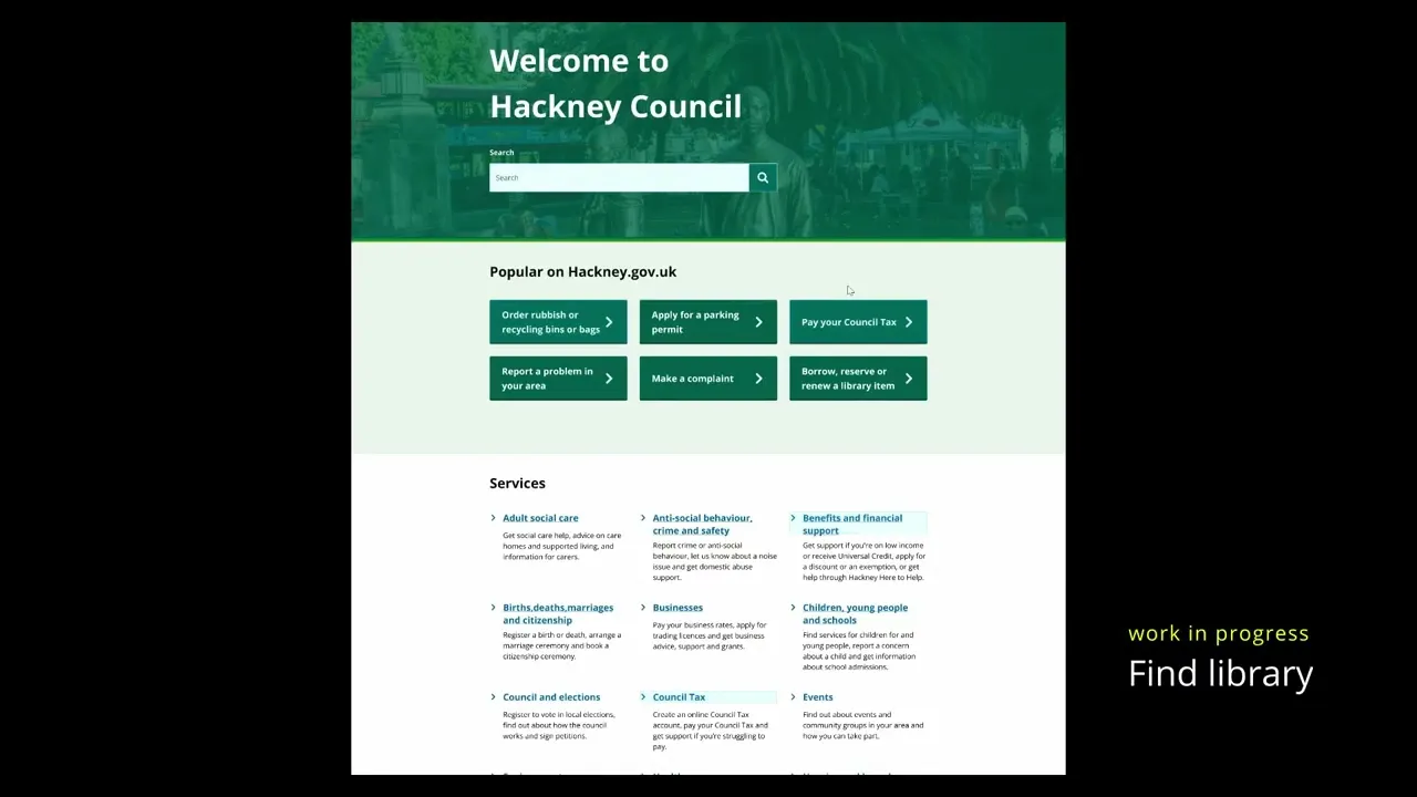
Hackney Council — Main Website redesign and replatforming
I led interaction design for the redesign and replatforming of hackney.gov.uk, replacing a fragmented WordPress website with an accessible, task-focused platform built on LocalGov Drupal.
I joined during discovery and led interaction design through research, structural definition, prototyping, usability testing, design system development, and implementation.
Following launch, resident satisfaction, findability, and task completion improved, with measurable gains across key service journeys.
Focus
Designing a system that scales
Improving task findability and completion
Leading interaction design from discovery through build
project type
Public sector
Industry
Government (Local Authority)
Role
Interaction Designer
Date
June 2024 - July 2026
Top summary (TL;DR)
Role: Design owner for interaction and some structural decisions from discovery through build
Context: Council-wide replatforming of Hackney's primary digital channel, serving over one million residents each year, onto LocalGov Drupal.
Problem: Resident tasks were hard to find, the website structure reflected council organisation rather than user intent, and CMS constraints blocked updates and improvements
What changed: Redesigned the information architecture, defined reusable page models, and created a CMS-aligned design system
How: UX and design system audits, IA testing, responsive prototypes, usability testing, agile delivery, and close design-build collaboration
Outcome: A scalable, accessible platform designed around resident tasks and implemented through reusable patterns
Impact: Resident satisfaction, findability, and task completion improved after launch, alongside measurable gains across key waste and recycling journeys
Results
Post-launch data showed measurable improvements in resident journeys, satisfaction, and findability.
+13 percentage points
Bulky waste journey completion
+10 percentage points
Residents mostly or fully completing their task
+7 percentage points
Residents finding information easy to find
+7 percentage points
Resident satisfaction
100%
Automated accessibility score

Problem
hackney.gov.uk is the council's primary digital channel, used by over a million residents each year. Despite high usage, discovery work showed the site was failing both residents and internal teams.
Key issues included:
Navigation mirrored council structures rather than resident goals
No usable service landing pages
A partial design system that could not be applied consistently
CMS limitations blocking accessibility improvements
Hundreds of inconsistent pages and touchpoints
High contact volumes linked to failed self-service attempts
Most residents tried to self-serve online first. When they struggled to find or complete a task, they often gave up and contacted the council instead.
Major issue: A cycle of failed self-service increased frustration for residents and demand on contact centre staff.
Solution
Discovery concluded that incremental improvements would not address the underlying problems.
The website needed to be replatformed onto LocalGov Drupal, paired with a redesigned information architecture and a design system aligned with how the CMS actually worked.
This approach allowed us to:
Redesign journeys around resident tasks
Introduce service landing pages
Standardise components and patterns
Address accessibility issues at source
Create a platform that could be iterated without repeated structural rework
1 . Audit and diagnose
1.1
Purpose
Understand why the existing website was failing and where improvements were structurally blocked.
This phase focused on diagnosing system-level problems rather than proposing solutions too early.
1.2
Reviewing the live site against the design system
I audited the live website against Hackney's existing design system to understand how it was being applied in practice.
I found that:
Only 19% of the design system aligned with what was live
The design system could not be relied on as a source of truth for delivery
Many documented components were unused or could not be implemented
Common patterns existed as one-off solutions
Visual and interaction consistency varied widely between sections
The review was complicated by multiple sources of design guidance. The documented design system and Figma patterns did not consistently match what had been implemented on the live website.
This created uncertainty around which patterns teams should follow and contributed to inconsistency and rework.
Design system audit comparing documented styles and components against live implementation. The review highlighted inconsistencies between design system guidance, Figma patterns, and delivery, reinforcing the lack of a single source of truth.
1.3
UX audit and recommendations
Alongside the design system review, I carried out a UX audit of the existing website to assess usability, navigation, accessibility, and task completion.
The audit evaluated:
Landing pages
Navigation and information architecture
Search usability
Task completion and forms
Content clarity and visual hierarchy
Error handling
Performance and accessibility
The site scored 51.2% overall, showing significant room for improvement across core resident tasks.

UX audit findings illustrated through the previous homepage, highlighting a content-heavy layout with mixed priorities and limited support for common resident tasks. The audit scored the site at 51.2%.
1.4
Identifying structural constraints
I worked with the team to identify where problems were caused by content, design, or platform limitations.
Key constraints included:
CMS limitations preventing changes to navigation and page templates
Accessibility issues embedded within layouts and third-party content
Inconsistent component behaviour that could not be standardised
High effort and risk associated with small interface changes
Many known usability problems could not be addressed locally or incrementally.
1.5
Documenting gaps between intent and reality
I documented where:
Design patterns existed in theory but not in the CMS
Editors relied on workarounds to publish content
Accessibility problems could not be resolved at source
Design debt increased with each workaround
This helped separate delivery problems from platform problems.
It became clear that repeated fixes were compounding the problem rather than reducing it.
1.6
Outcome
The audit showed that many website problems resulted from structural and platform limitations rather than individual pages or isolated design decisions.
Incremental fixes would:
Add complexity
Increase maintenance costs
Leave core problems unresolved
This work contributed to the decision to replatform the website alongside redesigning its information architecture and interaction patterns.
2 . Define structure and direction
2.1
Aligning on goals and constraints
This phase translated discovery findings into structural decisions before detailed interface design began.
The focus was on agreeing what needed to change across information architecture, navigation, and page structure rather than designing screens too early.
I worked with product, content, research, and service design to align on what the new website needed to achieve and the constraints we had to work within.
This included:
Clarifying the website's role in resident self-service
Agreeing success measures beyond visual consistency
Acknowledging CMS and delivery constraints early
This reduced the risk of designing solutions that could not be implemented or maintained.
2.2
Redefining the information architecture
Using discovery and research findings, we restructured the information architecture around resident tasks and service outcomes rather than internal council structures.
I contributed to:
Defining a new top-level structure
Reducing depth and duplication
Creating a new sitemap to represent the proposed structure
The aim was to make it easier for residents to predict where information would live and move between related services.
Hierarchical sitemap organised by user intent and content depth, showing relationships from the homepage through primary sections and subpages. This view supported information architecture validation and tree testing.

Structural sitemap organised by interface zones, grouping pages by where they appear in the interface. This helped align information architecture with navigation patterns and layout constraints.
2.3
Validating the structure through tree testing
We used tree testing to evaluate whether residents could find content within the proposed structure before applying visual design.
This allowed us to:
Measure findability without interface bias
Identify confusing labels and groupings
Refine the structure based on evidence
I used the findings to iterate the sitemap before moving into detailed interaction design.
Similarity matrix capturing how users grouped related content, used to validate and refine the proposed information structure before detailed design.
2.4
Setting design direction
Alongside the information architecture work, we agreed principles to guide later design decisions.
These included:
Prioritising clarity over flexibility
Designing patterns for consistency at scale
Reducing reliance on bespoke layouts
Supporting accessibility by default
These principles informed page models, component design, and later build decisions.
2.5
Outcome
By the end of this phase, we had:
A validated information architecture
A clear sitemap to design against
Shared agreement on direction and constraints
Detailed interaction design could now focus on solving resident problems rather than repeatedly revisiting structural decisions.
3 . Design the system
3.1
Purpose
The next phase focused on designing reusable page types and components that supported the new information architecture and could be implemented reliably through LocalGov Drupal.
The focus was on systems rather than individual screens.
3.2
Designing page types
Rather than designing one-off layouts, I defined a small set of page types to structure content consistently across the website.
These included:
Homepage
Service landing pages
Sub-landing pages
Service content pages
Search results
Each page type had:
A clear purpose
Defined content areas
A restricted set of supported components
This reduced variation and gave content teams clearer structures to work within.
Page type structures defining consistent layouts, content areas, and component usage rules. These wireframes focused on structure and behaviour rather than visual styling.
3.3
Building a new design system
I led the creation of a website design system in Figma aligned with the components and patterns that could be implemented through the new CMS.
The system:
Reflected what could realistically be built
Prioritised reuse over unrestricted flexibility
Aligned components with real content needs
Defined consistent behaviour across the website
It included global components such as navigation, footer, and search alongside patterns used within specific page types.
CMS-aligned design system built in Figma to support reuse, consistency, and build feasibility.
3.4
Designing across breakpoints
I designed desktop, tablet, and mobile experiences in parallel rather than treating responsive behaviour as a later adaptation.
I:
Designed layouts to respond across viewports from the start
Defined component behaviour at different sizes
Created wireframes and interactive prototypes for each breakpoint
This reduced late design changes and helped prevent desktop-first assumptions from reaching build.
Breakpoint reference showing how layouts and components adapt across desktop, tablet, and mobile. Responsive behaviour was defined in parallel rather than added after desktop design.
3.5
Prototyping and interaction behaviour
I created interactive prototypes to:
Validate navigation and page flow
Test component behaviour
Support design reviews and sign-off
Communicate interaction intent to developers
The prototypes explored complete resident journeys rather than isolated screens.
Work-in-progress prototype exploring end-to-end resident journeys, including paying a parking fine and council tax, before implementation.
3.6
Outcome
By the end of this phase, we had:
Page models aligned with the new information architecture
A reusable design system ready for delivery
Responsive behaviour defined across breakpoints
Interactive designs ready for testing and build
This system became the foundation for service-level design work.
4 . Applying the system: Waste and recycling
4.1
Choosing a real service to test the system
Waste and recycling was selected as an early service area because it was:
One of the most visited sections of the website
A frequent source of resident confusion and contact demand
A strong test of service landing pages and task-focused journeys
This gave us an opportunity to apply the emerging design system to real resident tasks before wider implementation.
4.2
Applying the page model
I applied the new page model and component rules to the waste and recycling section.
This included:
A service landing page surfacing common tasks
Consistent structures across desktop, tablet, and mobile
Reusable components rather than bespoke layouts
Clear separation between task actions and supporting information
The aim was to help residents identify what they could do quickly while keeping secondary information accessible.


Waste and recycling service landing page and prototype map, applying the new page model to a high-traffic service. Key tasks and supporting content were mapped before build to test structure and flow.
4.3
Prototyping real tasks
I created an end-to-end interactive prototype in Figma covering the wider waste and recycling section.
Within this prototype, we focused usability testing on two common resident tasks:
Ordering replacement bins and bags
Booking a bulky waste collection
The prototype mapped complete journeys and supporting pages rather than testing individual screens in isolation.
Designs were produced across desktop, tablet, and mobile, with interaction behaviour defined consistently across each breakpoint.
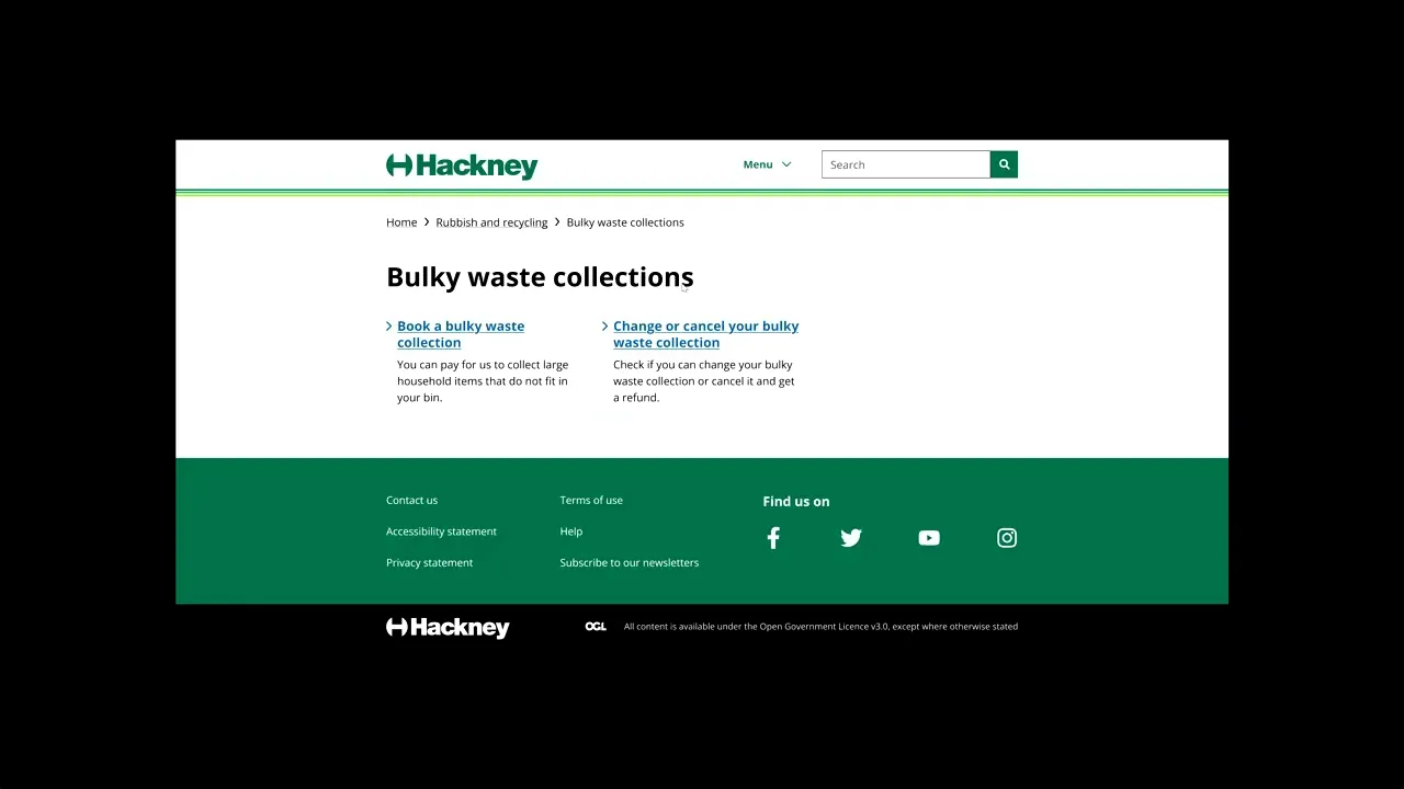
End-to-end waste and recycling prototype used to test replacement bin and bag ordering and bulky waste booking journeys with residents.
4.4
Collaboration with content and research
I worked closely with Content Designers and User Researchers throughout the work.
Content Designers shaped page structures and language around resident needs and real service content.
User Researchers supported research planning, moderation, and analysis.
Interaction and content design were iterated together rather than sequentially, meaning prototypes used realistic content rather than placeholder layouts.
4.5
Usability testing and iteration
We tested the prototype through moderated usability sessions with Hackney residents representing a mix of ages, income levels, and digital confidence.
Testing focused on:
Whether residents could identify the correct task
Whether page structures matched expectations
How tiles, breadcrumbs, and callouts were understood
Key findings included:
Breadcrumbs helped residents orient themselves
Task shortcuts worked well but needed careful visual weighting
Descriptive tiles helped set expectations
Residents often skipped long explanatory content
Accordions and callouts were frequently overlooked
I used these findings to refine layouts, content hierarchy, and component behaviour before build.

Seven residents took part in usability testing, consistent with the Landauer–Nielsen model for identifying the majority of usability issues. Participants represented a mix of ages, income levels, and digital confidence.
4.6
Post-launch journey performance
Following launch, we compared performance on the new LocalGov Drupal pages with the previous WordPress experience.
Because key waste and recycling forms sit outside hackney.gov.uk, full end-to-end completion could not be measured. Outbound clicks to key forms were therefore used as a proxy for journey completion.
The redesigned journeys improved across all four tasks measured:
Book a bulky waste collection: completion increased from 44% to 57% (+13 percentage points), while abandonment fell from 56% to 43%
Report a missed collection: completion increased from 66% to 70%, with journey time reducing from 23.1 to 15.7 seconds
Order bin bags: completion increased from 86% to 89%, while abandonment reduced from 14% to 11%
Check collection day: completion increased from 90% to 92%, with journey time reducing from 9.3 to 7.2 seconds
The strongest improvement was the bulky waste journey — one of the two journeys I had specifically prototyped and tested with residents before build.
Post-launch behaviour supported the design direction established through research: clearer task entry points, stronger calls to action, and simpler journey structures.

Waste and recycling journey completion before and after launch. Completion improved across all four measured tasks, with the largest increase for bulky waste bookings, from 44% to 57%.
4.7
Resident outcomes
Post-launch resident feedback also showed improvements across the three experience measures we tracked.
Across 330 survey responses:
58% of residents were satisfied, compared with 51% on the previous website
62% found information easy to find, compared with 55%
57% mostly or fully completed their task, compared with 47%
Average survey scores improved across satisfaction, findability, and task completion.
These results aligned with patterns identified during usability testing. Clearer task entry points, content hierarchy, and more visible routes to services were reflected in improved post-launch resident feedback.
This closed the loop between research, design decisions, and measurable resident outcomes.

Average resident survey scores before and after launch. Satisfaction, findability, and task completion improved across 330 responses.
5 . Agile delivery and collaboration
5.1
Working in sprints with the UCD team
Interaction design was delivered through UCD sprints alongside service design, content design, user research, and product management.
I planned and prioritised interaction design work sprint by sprint, adapting to research findings, content needs, and delivery constraints.
Collaboration included:
Working with Service Designers to align page interactions with wider service journeys
Partnering with Content Designers to shape structures around real content
Working with User Researchers to test and iterate emerging patterns
Working with the Product Manager to agree scope, priorities, and decision points
I shared work in progress early rather than waiting for large handover moments.
Regular catch-ups and informal Slack discussions allowed feedback to be incorporated incrementally. As constraints emerged, we documented and discussed trade-offs before they became build problems.
5.2
Integrating design and build
When our external delivery partner joined the project, design and development moved into a shared delivery rhythm.
I:
Aligned design priorities with development sprints
Walked developers through designs before implementation
Clarified interaction behaviour, responsive patterns, and edge cases
Reviewed implementation against design intent
Worked through issues within the sprint
Design was not handed over at a single point. I stayed involved as components, templates, and page types moved into build.
5.3
Adapting our ways of working
Our process evolved as the project moved from design into implementation.
We used:
Interaction design catch-ups to review work in progress and agree priorities
Sprint planning to align design readiness with build timelines
Design reviews and sign-off sessions to confirm decisions
Slack for day-to-day clarifications and edge cases
Ceremonies and roles remained flexible. We combined or adjusted steps when the project required it rather than following process for its own sake.
5.4
Outcome
Working in a shared agile rhythm allowed interaction design to move from discovery through implementation without a hard design-to-development handover.
This kept design decisions grounded in research, content, and technical constraints throughout delivery.
6 . Design-build collaboration
6.1
Staying involved through implementation
My role continued after designs were approved.
I stayed closely involved as developers implemented components, templates, and page types, reviewing the build against the intended interaction behaviour.
This was particularly important because the design system needed to work through LocalGov Drupal rather than exist only in Figma.
6.2
Aligning design and development
Before development began on key patterns, I walked developers through:
Interaction behaviour
Component states
Edge cases
Responsive behaviour across desktop, tablet, and mobile
Relationships between components and page types
Where CMS or technical constraints affected a design, I worked with developers to understand the limitation and agree an alternative that remained consistent with the wider system.
6.3
Reviewing implementation
As components and templates moved into build, I:
Checked implementation against Figma
Flagged inconsistencies early
Reviewed responsive behaviour
Worked with developers to resolve issues within the sprint
Updated designs when agreed trade-offs changed the final pattern
This reduced design drift and helped keep patterns coherent as the system expanded.
6.4
Supporting delivery decisions
Not every design could be implemented exactly as first proposed.
When trade-offs were required, I:
Worked with developers to understand the constraint
Assessed the effect on resident tasks
Agreed pragmatic alternatives
Documented decisions and follow-up work
The goal was not pixel-perfect implementation at any cost. It was to preserve the purpose and behaviour of the design while working within delivery constraints.
6.5
Outcome
Close design-build collaboration helped maintain:
Consistent component behaviour
Defined responsive patterns
Alignment between Figma and implementation
A system that could be extended through the CMS
Staying involved through implementation meant interaction design remained part of delivery rather than ending at handover.
7 . Impact and outcomes
7.1
Measuring post-launch performance
After launch, the team benchmarked the LocalGov Drupal website against the previous WordPress experience.
Performance was evaluated using:
Resident feedback
Journey completion and abandonment
Search performance
Accessibility
Page performance and uptime
Content team feedback
This allowed us to evaluate the redesign against resident and operational outcomes rather than visual or stakeholder feedback alone.
7.2
Resident experience improved
Post-launch feedback showed improvements across the core resident experience measures.
Resident satisfaction increased from 51% to 58%.
The proportion of residents finding information easy to find increased from 55% to 62%.
Residents reporting that they mostly or fully completed their task increased from 47% to 57%.
At the same time, residents reporting low or no task completion fell from 42% to 31%.
The early results suggested that the new structure and task-focused patterns were helping more residents identify and reach what they came to the website to do.
7.3
Search and accessibility performance
Performance improvements extended beyond individual service journeys.
Google Search clicks increased by 31%, from 246,000 to 322,000, when comparing May 2026 with May 2025.
Click-through rate increased from 3.5% to 5.8%, while average search position improved from 28.3 to 9.9.
Automated accessibility scores increased from 88% to 100% across the Lighthouse and Silktide measures used in our post-launch analysis.
Desktop Lighthouse performance also increased from 91 to 97, with Largest Contentful Paint reducing from 1.9 to 1.3 seconds.
Mobile page performance remained broadly unchanged and continues to be an area for optimisation.

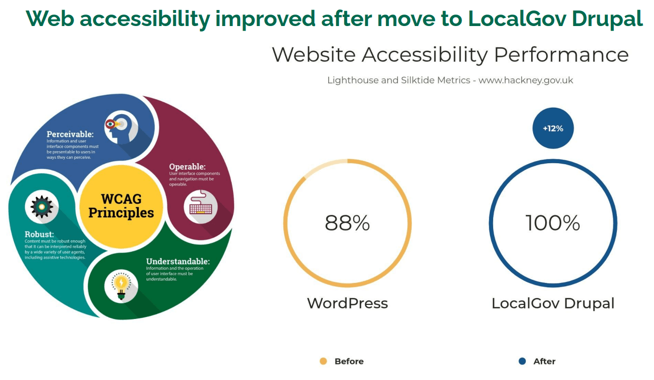

Image 1: Google Search performance in May 2025 and May 2026. Clicks increased by 31%, while click-through rate and average ranking also improved.
Image 2: Accessibility performance before and after migration, based on Lighthouse and Silktide measures.
Image 3: Desktop Lighthouse performance after migration. The score increased from 91 to 97, with faster loading of the page’s main content.
7.4
A better system for content teams
The replatforming also changed how internal teams managed website content.
Before migration:
75% of the content team were dissatisfied with WordPress
75% found it difficult or very difficult to use
100% rated it as inefficient
Following the move to LocalGov Drupal:
4 in 4 content team members were satisfied
4 in 4 found the CMS easy to use
3 in 4 rated it efficient or very efficient
4 in 4 rated technical performance as good
The survey covered all four members of the content team before and after migration.
While the sample was small, it represented the full team responsible for day-to-day content management.
This showed that the new platform supported two sides of the service: residents completing tasks and the teams responsible for maintaining the website.
8 . Reflection
8.1
What I learned
Hackney was the first project where I was able to stay from discovery through to post-launch evaluation, giving me a much broader perspective on what successful product delivery looks like. Beyond improving my interaction design practice, it became a period of significant professional growth.
Working on a long-running programme meant continuously adapting to new tools and ways of working. I adopted new Figma capabilities such as variables, explored AI-assisted design workflows to improve efficiency, and expanded my prototyping skills using both the GOV.UK Prototyping Kit and ProtoPie. I also developed my visual communication skills through Adobe After Effects and rebuilt my portfolio in Framer, expanding my capabilities beyond interface design into motion design and no-code website development.
I also began mentoring less experienced designers, organising Figma workshops and providing day-to-day guidance to help build confidence, improve design quality, and encourage more consistent ways of working across the team.
Perhaps most importantly, the project reinforced that great design is a continuous learning process. The tools, technologies, and expectations of designers evolve quickly, and I've learned the importance of staying curious, investing in new skills, and sharing that knowledge with others.
This case study reflects my personal work and experience. It has been independently prepared for portfolio purposes, with confidential and personally identifiable information removed, and does not represent an official publication by Hackney Council.