Expert App — Mobile UX Coursework Project
Concept mobile app exploring how gamers could connect with expert coaches for personalised guidance.
Disclaimer: Bootcamp coursework project to practise end-to-end UX process. Not built or shipped.
project type
Bootcamp Coursework
Industry
Tech
Focus areas
User research
Prototyping and usability testing
Date
Nov 2018 - Jan 2019

Problem
New and improving players struggle to find expert advice that is relevant to their specific needs. Existing platforms rely on generic guides or high-level content that lacks personalisation and real-time feedback.
At the same time, skilled players have limited ways to monetise their expertise without building an audience or producing content at scale.
The challenge was to explore how a mobile experience could support:
finding the right expert
communicating needs clearly
booking and managing coaching sessions
Solution
A native mobile app concept that allows users to browse expert profiles, message coaches directly, and book coaching sessions through a simple, task-focused flow.
The concept focused on reducing friction in:
finding a suitable expert
understanding what a session would involve
scheduling and preparing for coaching

Process
I began by clarifying the core goals of the project through competitor analysis, business requirements, user stories, and generative user interviews.
1 . Discover
1.1
Competitor Analysis
In my competitor analysis, I reviewed two established platforms offering expert gaming advice: Gamer Sensei and Game-Coach. Gamer Sensei provided a polished, easy-to-use experience that made it simple to find and book coaches, but its premium pricing and lack of multilingual support limited accessibility and global reach.
Game-Coach offered broader regional availability and greater flexibility for non-English-speaking users, but its interface and navigation were less refined, creating friction for users seeking quick, efficient interactions. Together, these platforms revealed a gap for a concept that balanced usability, affordability, and accessibility without relying on competitive status or brand recognition.
Key takeaways from this analysis
A polished interface alone was not enough to build trust without clear availability and pricing
Teaching quality and communication mattered more to users than competitive status
Global accessibility and language support influenced perceived inclusivity
Existing platforms made it hard to understand what would happen after booking
These takeaways informed how expert profiles, messaging, and scheduling were prioritised in the concept.
1.2
Requirements & User Stories
To frame the scope of the concept, I defined a small set of exploratory objectives documented in the business requirements, focused on understanding what would make the platform viable for both coaches and players. These objectives provided direction for the scope and focus of the prototype.
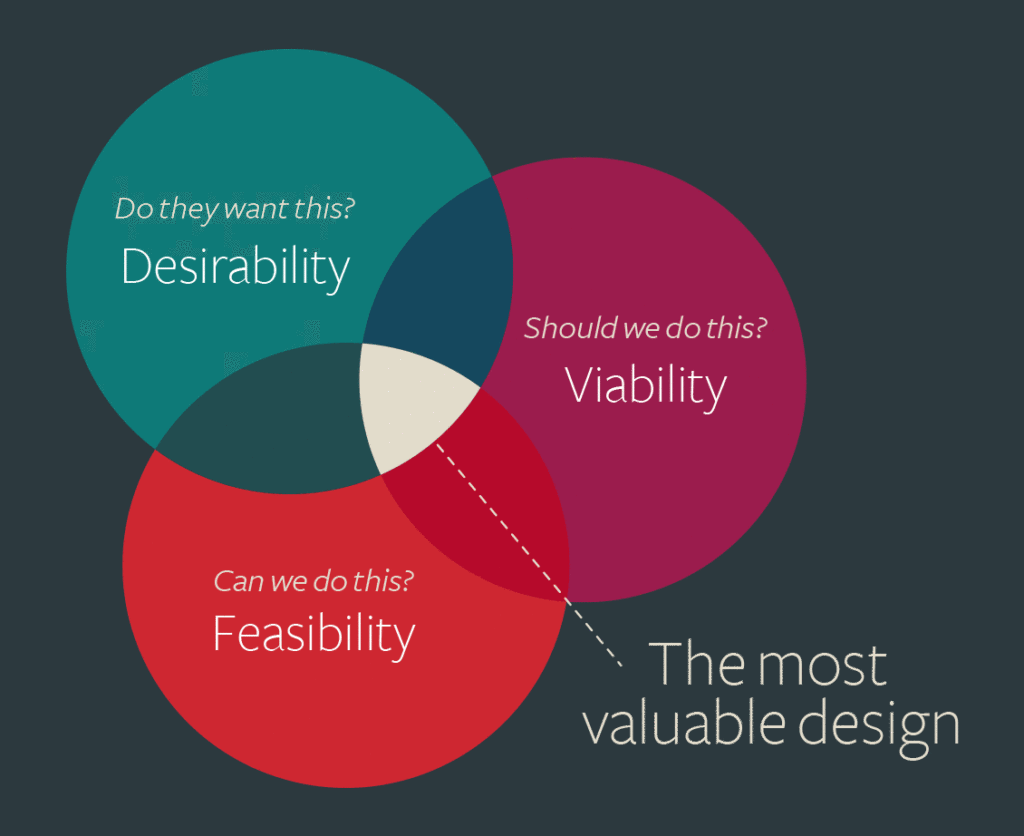
Good solutions are feasible, viable, and desirable
I then translated the business requirements into user stories that focused on core features essential to the concept. This process helped ensure that each feature served a clear purpose for the end user. Using a structured format—As a [role], I want [feature], so that [desired outcome]—I outlined user stories such as:
Login/Signup: "As a user, I want to sign up/sign in using an existing account (e.g. Facebook, Gmail), so I don’t forget my password."
Scheduling Calendar: "As a user, I want a seamless calendar to view the coach’s availability, so I can schedule my lesson easily."
Language and Region Selection: "As a user, I want lessons in my preferred language, so I can fully understand the content."
These user stories were used as a design scaffold rather than a delivery backlog, helping prioritise flows and interactions for the prototype.
1.3
User Interviews
Interviews with newer players and experienced gamers highlighted that users valued teaching ability and relevance over raw skill ranking. Both groups wanted structured sessions that still felt tailored, and clear communication before booking to reduce uncertainty.
I used semi-structured interviews to explore user motivations, expectations, and attitudes toward coaching. This helped challenge assumptions, including whether expert gamers’ skills were under-monetised, and ensured design decisions were grounded in real user needs rather than personal bias.
I sampled both expert gamers and newer players to capture diverse perspectives, with research goals focused on understanding whether players were willing to seek coaching, what resources they currently used, and what motivated them to learn from experts. I asked open-ended questions to foster natural conversations, avoiding any leading or biased phrasing. Sample questions included: “What qualities do you look for in an expert?” and “What features would be most relevant to you?”
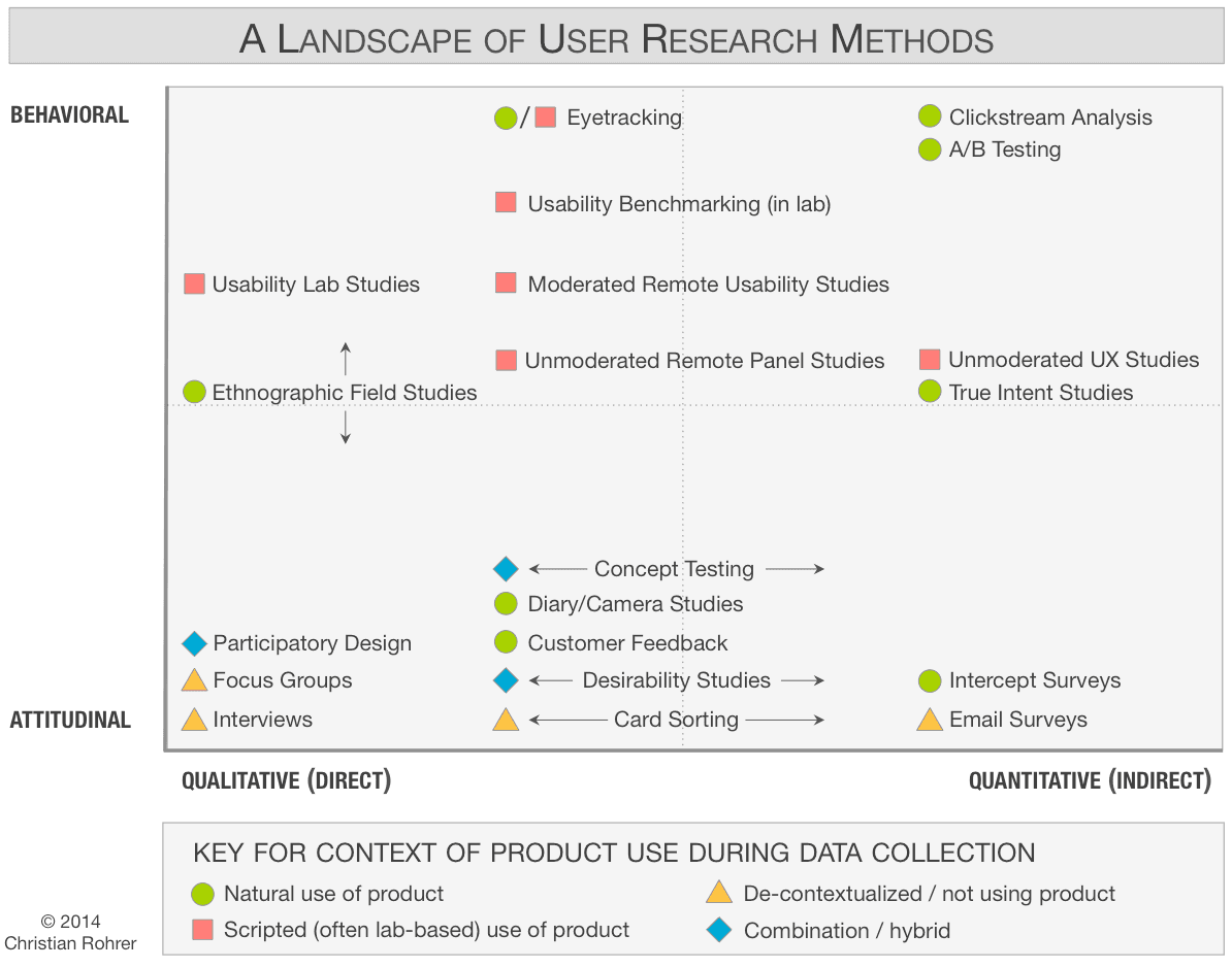
I got to use a nice mix of both qualitative (user interviews) and quantitative methods (card sorting)
To synthesise findings, I used affinity mapping to group responses into themes such as expectations, barriers, and motivations. This revealed that while users wanted structured lessons, relevance and efficiency mattered more than rigid formats. Teaching ability consistently outweighed leaderboard ranking, confirming strong interest from both coaches and players.
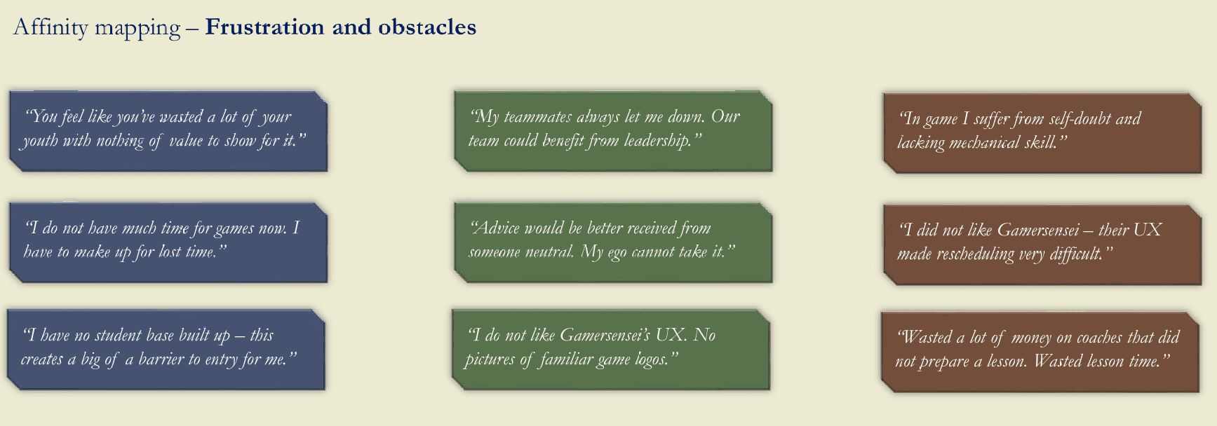
Organising user insights into themes helped to uncover key patterns and drive design decisions. Common themes included frustration with teammates
2 . Define
2.1
User Personas
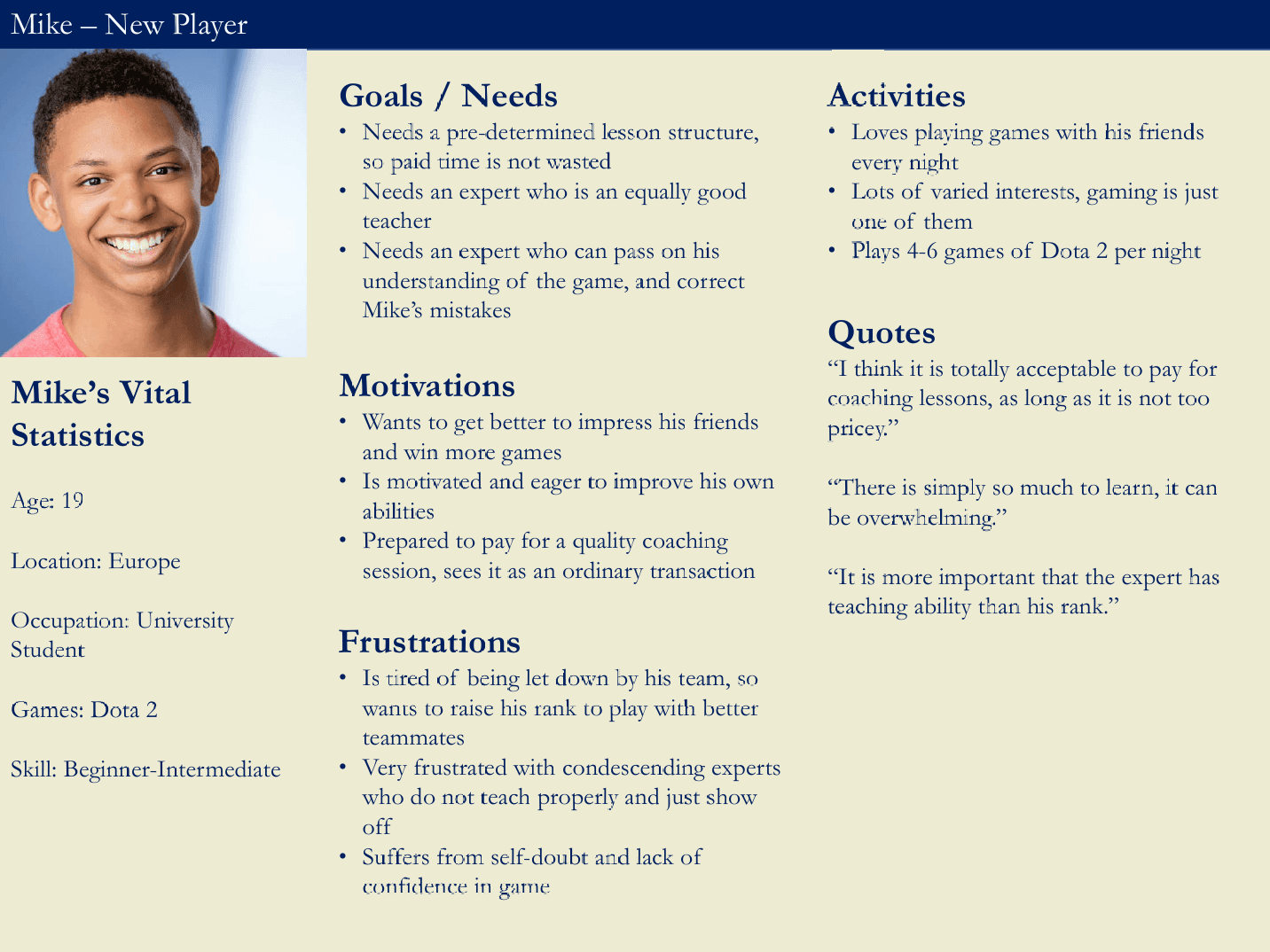
Research showed that players were willing to pay for coaching if pricing felt fair and outcomes were clear. They valued structured lessons and prioritised teaching ability over in-game rank. A smooth booking experience, particularly around scheduling, was critical. Experts were motivated to monetise their skills but lacked reliable access to students, making discoverability and communication essential.
At this point, I crafted the problem statement:
"By creating an engaging mobile app that offers a personalised lesson experience, Mike will overcome his lack of confidence in matches."
Using these insights, I developed two personas: Jason, an expert gamer, and Mike, a newer player. As the project progressed, Mike’s persona proved more valuable for shaping the app’s experience, as it centred on the player journey.
Key design decisions
Prioritised teaching style and session structure over leaderboard rank in expert profiles
Required pre-session messaging to support personalisation
Treated scheduling as a primary task rather than a secondary action
Reduced uncertainty before payment by surfacing availability and expectations early

2.2
Mental Model & User Journey
To better understand user expectations and emotional context, I mapped assumptions about how Expert should work. This helped identify moments of uncertainty and friction beyond surface-level task flows.
I began by defining key goals for different user personas, focusing on their motivations and pain points when using Expert. For example, I created a persona named Mike, who consistently loses matches and seeks coaching to improve his skills.
Next, I developed a user journey map that illustrates Mike’s process of achieving this goal. The map captures his thoughts, emotions, and tasks at each stage—from account creation to booking a session. By examining emotional lows, I identified specific opportunities to improve Mike’s experience.
For instance, the map highlighted anxieties Mike has about his privacy when creating an account and his concerns about paying upfront without immediate feedback from a coach. Addressing these issues allowed me to explore UX enhancements, such as adding an option to hide his profile and better communication around payment security and session booking timelines.
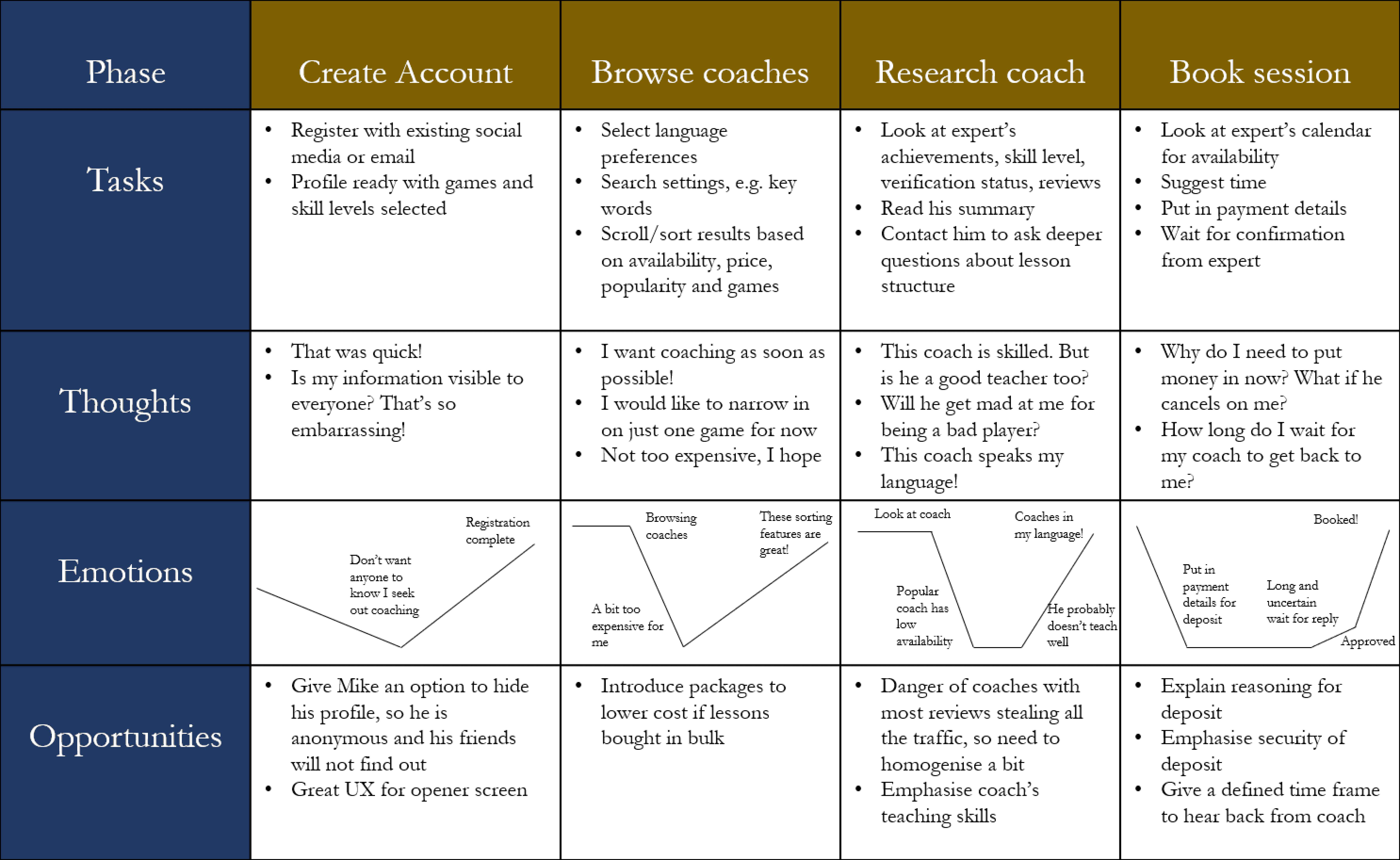
Looking at the troughs in Mike's emotions allowed me to identify opportunities to improve his UX
2.3
User Flow
I established a clear objective for my persona, Mike, which is to find a coach and book a lesson successfully. To support this goal, I created a user flow diagram that outlines the steps Mike must take to complete the task.
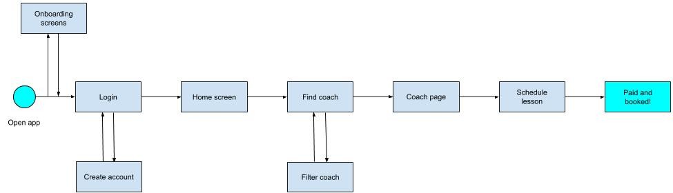
The flow begins with the entry point, where Mike opens the app, and ends with the success criteria: paying for and booking a coaching session. Each page Mike interacts with, from onboarding to final payment, is crucial to completing his goal.
To refine the user flow, I asked key questions:
What is motivating Mike to start this task? In this case, losing matches and wanting to improve his skills.
What additional information does Mike need to make a decision? This includes factors such as coach skill level, cost, and availability.
3 . Develop
3.1
Sitemap
To define the information architecture, I created an initial sitemap and refined it using a closed card sort. This revealed how users expected content and actions to be grouped and highlighted areas of ambiguity in the original structure.
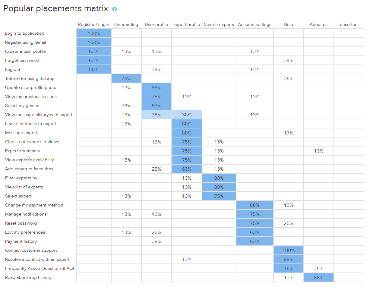
Results from card sorting, highlighting user preferences for content organization
Some results were straightforward, such as 'Register using Gmail,' which was placed 100% of the time in the 'Register' category. However, some areas, like 'Leave feedback,' had an even split between 'User profile' and 'Expert profile.' This suggested that certain items might need to exist in multiple categories for easier access.
Based on the feedback, I revised the sitemap. Items like 'Leave feedback' were placed in both 'User profile' and 'Expert profile.' These changes helped align the structure with user expectations, ensuring a more intuitive navigation experience.
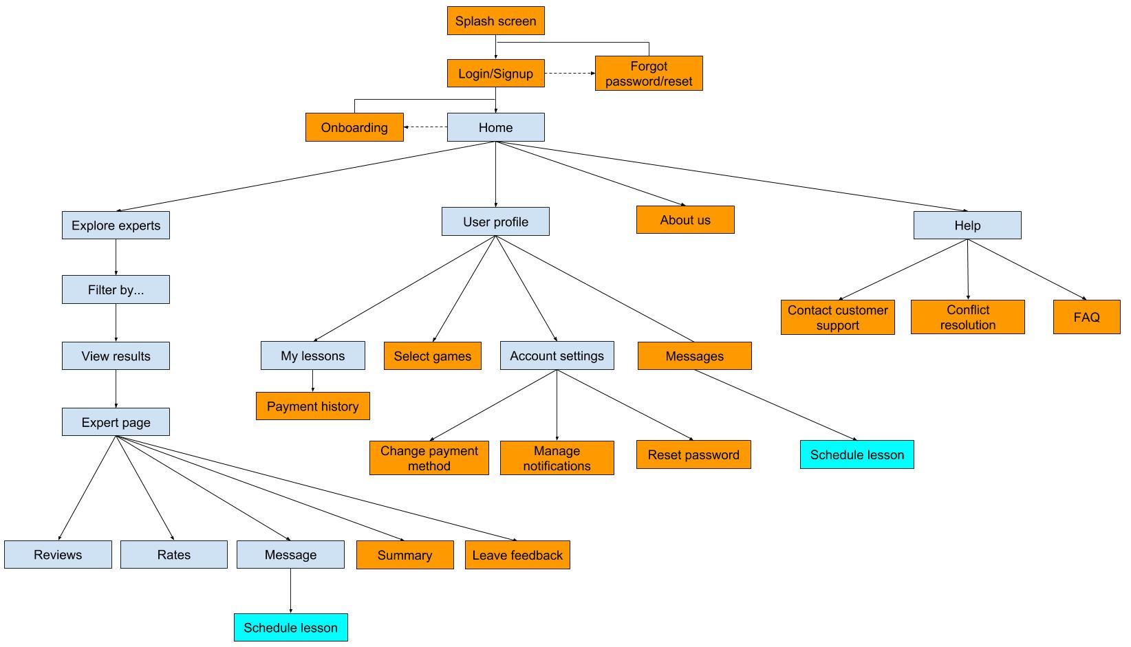
Updated sitemap based on card sorting findings, showing the refined structure
The card sorting exercise played a critical role in shaping the final information architecture for Expert. By involving users in the design process, I was able to create a structure that better aligns with their needs and behaviors.
3.2
Wireframing & Prototyping
Once the information architecture was finalized, I quickly moved into sketching paper wireframes. I moved from low- to high-fidelity wireframes to define layout, hierarchy, and interaction behaviour before usability testing.
I created the high-fidelity wireframes using Figma, focusing on clean layouts and interaction design. These were later turned into an interactive prototype using InVision for usability testing and feedback.
Feature 1: Login
Low Fidelity:

Initial low-fidelity wireframe of the login screen, focusing on the basic layout and structure
High Fidelity:
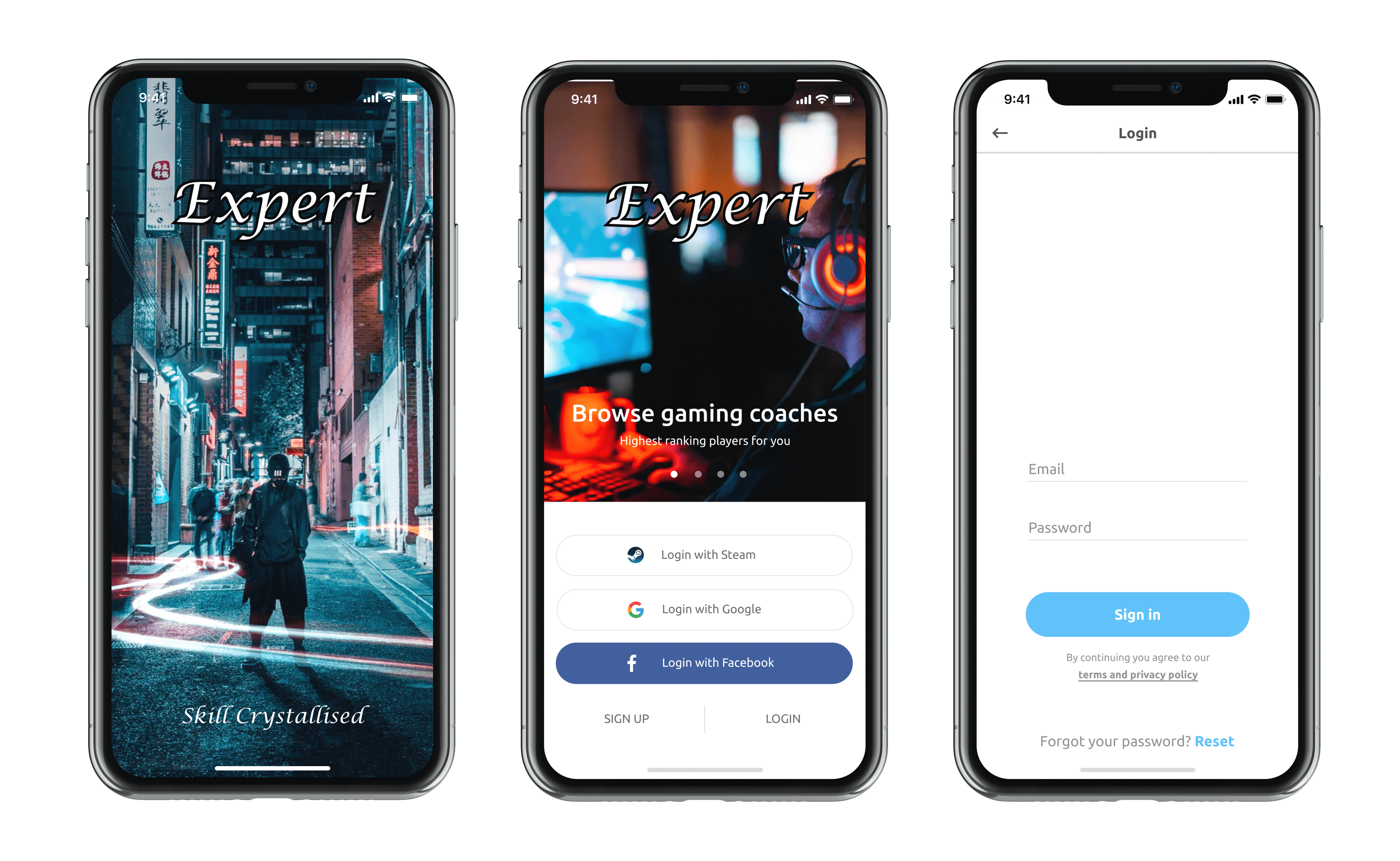
High-fidelity version of the login screen, with visual polish and interactive elements added
Feature 2: Find & Filter Experts
Low Fidelity:
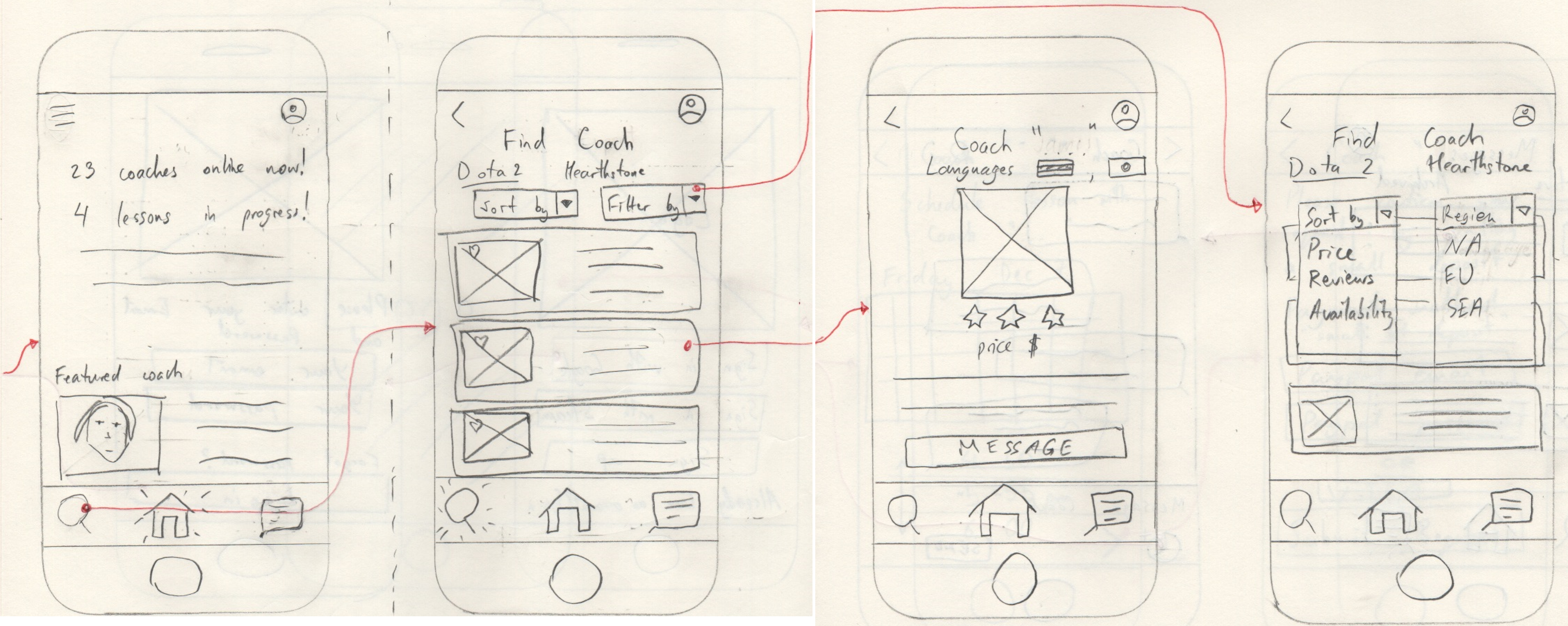
Low-fidelity wireframe showing how users can filter and find experts on the platform
High Fidelity:
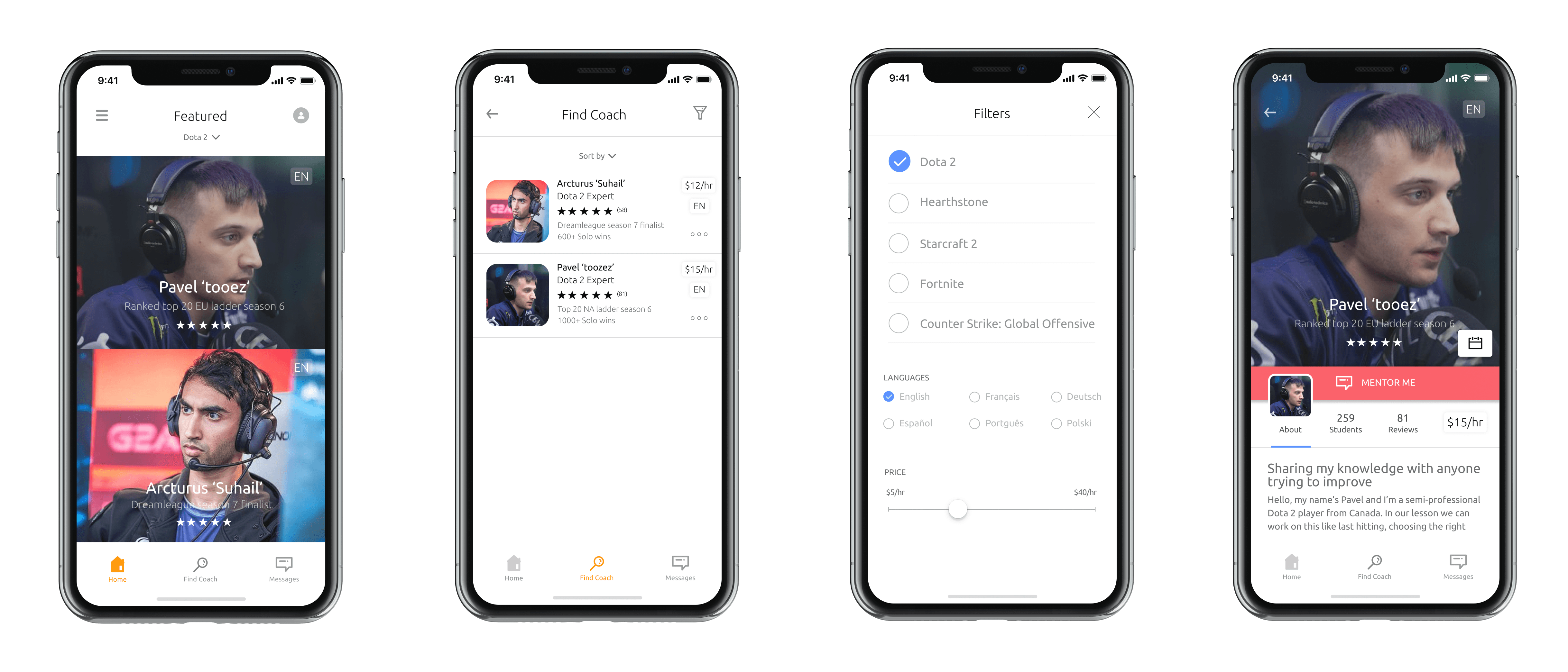
High-fidelity wireframe with refined visual elements, allowing users to find and filter experts easily
Feature 3: Message & Schedule Lessons
Low Fidelity:
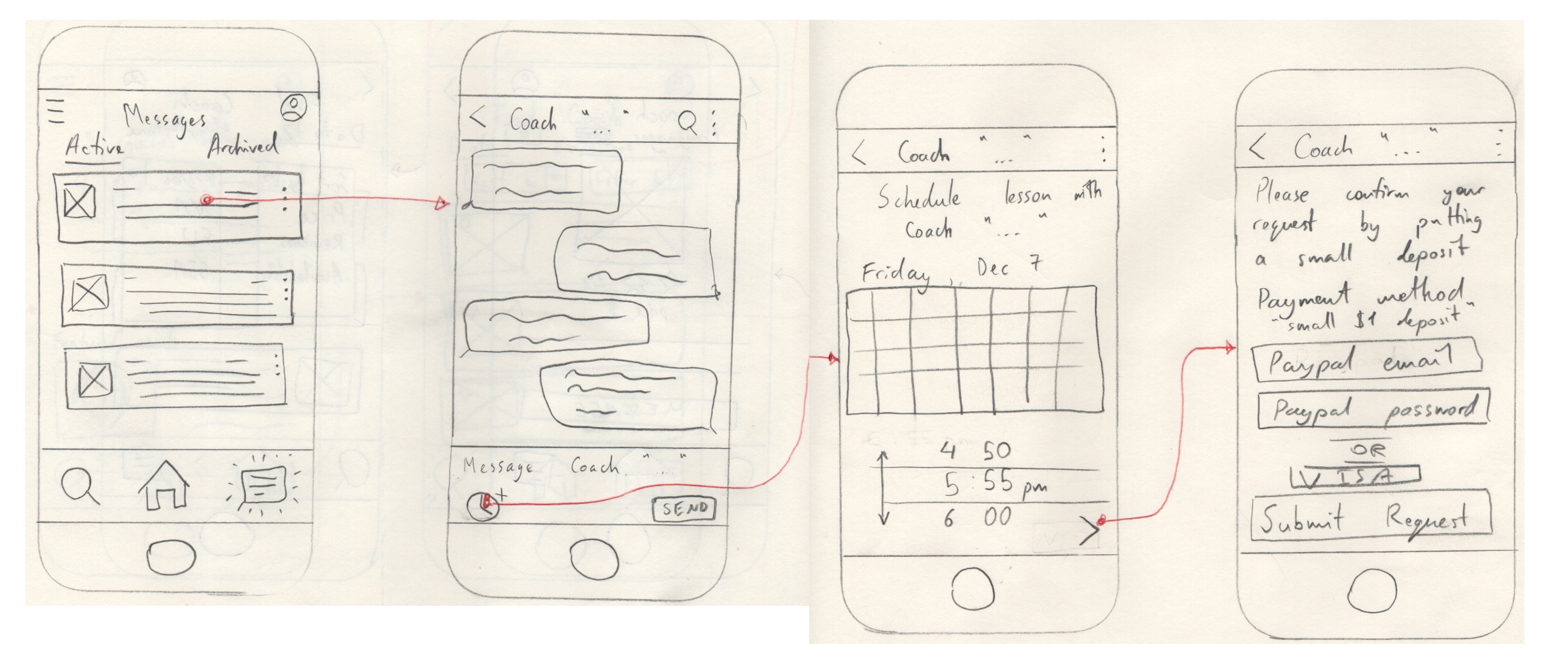
Low-fidelity wireframe for the messaging and scheduling features, focusing on functionality
High Fidelity:
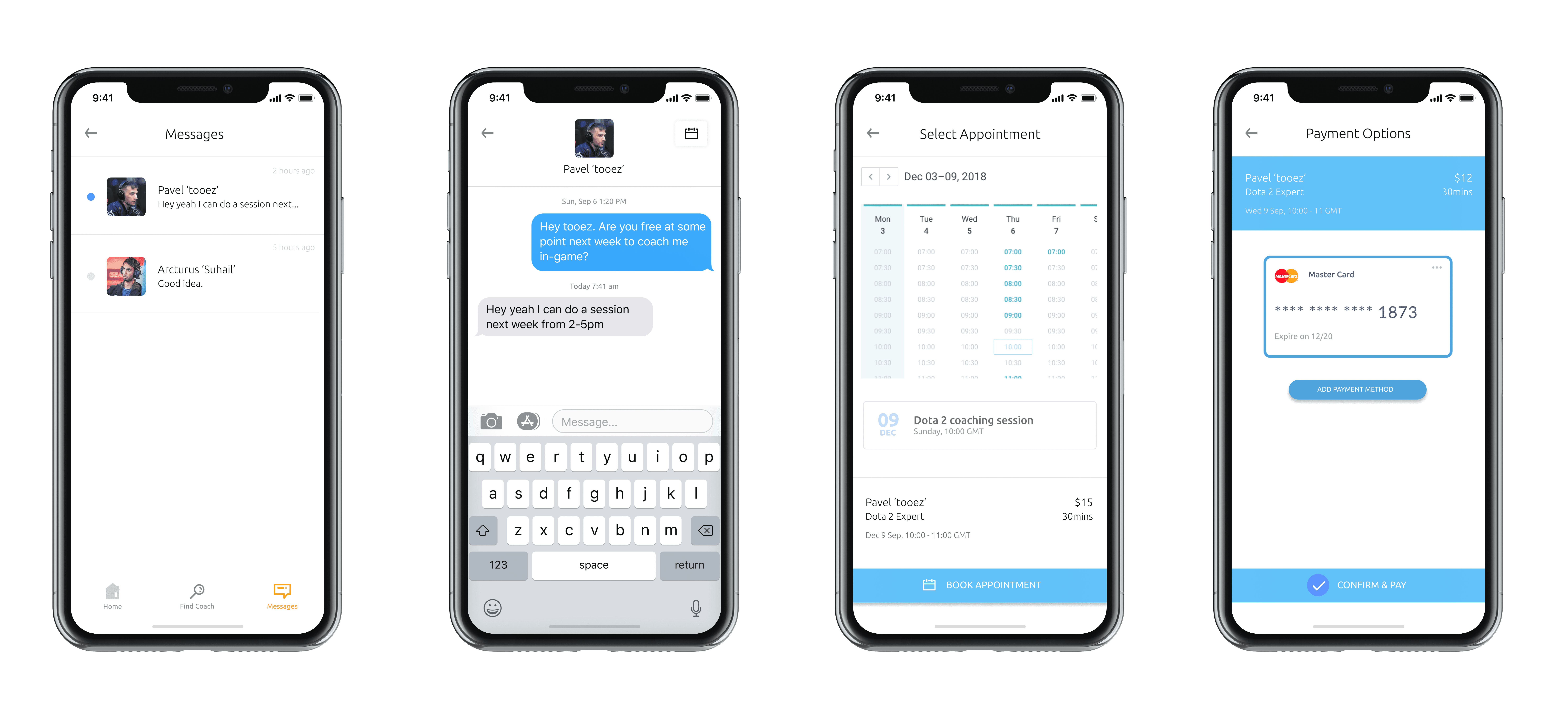
Final high-fidelity wireframe of the messaging and scheduling feature, ensuring a smooth user experience
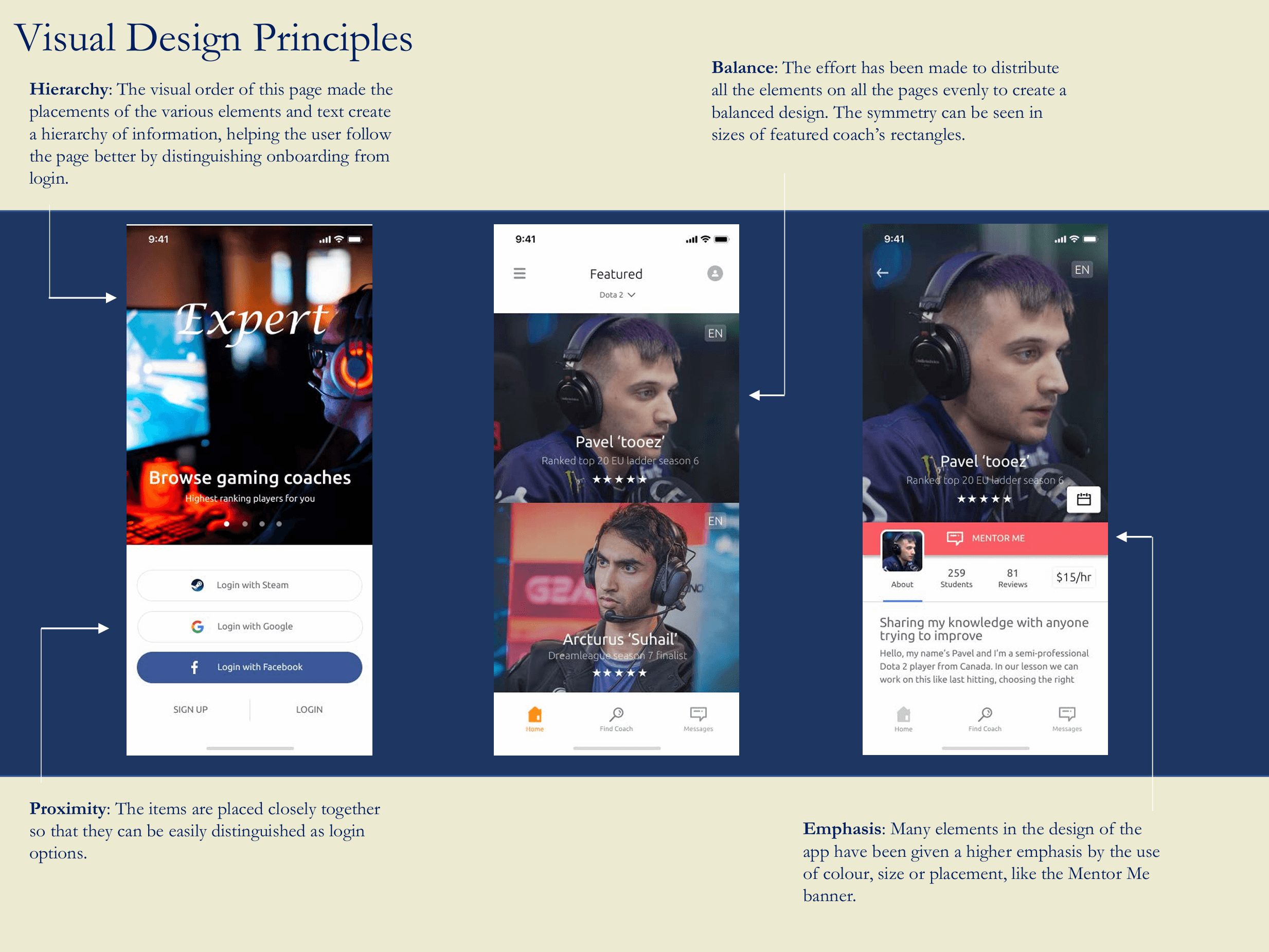
Application of Gestalt Visual Design Principles in the Expert App
3.3
Usability Testing
Six participants tested the prototype across onboarding, expert selection, and booking tasks. Testing focused on whether users could complete core actions without guidance.
For the test, I set the following objectives for participants to complete using the prototype:
Successfully complete onboarding and login to the home screen.
Search, filter by game, and select an expert.
Schedule a session with their chosen coach.
I observed and recorded responses across sessions with six participants who had gaming experience. I tracked how efficiently and easily users could complete the tasks.
I sorted and classified the results using an affinity map, focusing on the 'Errors' category to identify critical issues. Errors that blocked users from completing tasks were marked as 'critical' and were prioritized for fixes.
One key observation was that 5 out of 6 participants could not find the scheduling feature on the chat screen. To resolve this, I introduced coach marks (onboarding tooltips) to make the feature more noticeable.
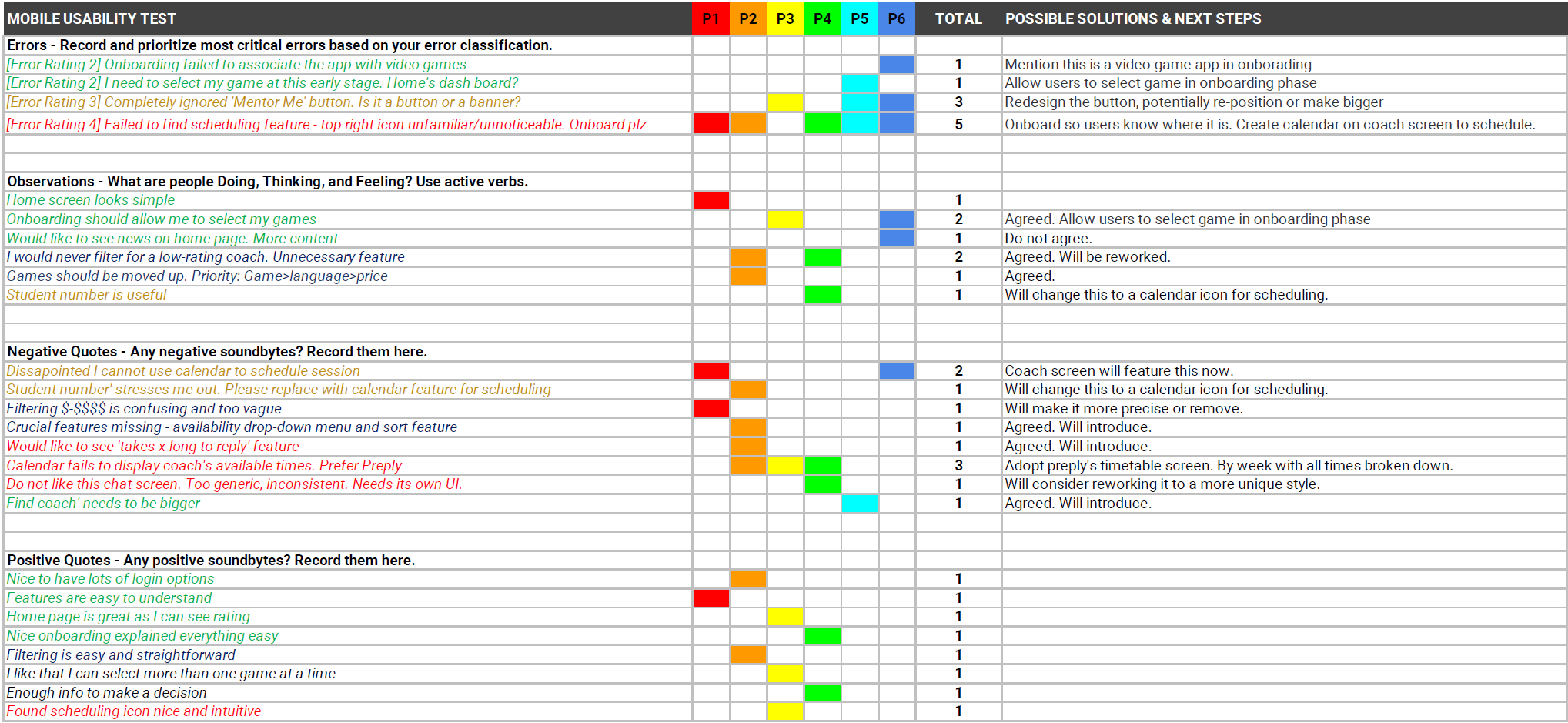
Affinity map used to organize usability test findings and classify errors
After addressing critical errors, I revisited the filter screen for preference testing. I used UsabilityHub to compare two filter screen versions, asking respondents which one they preferred.
9 out of 10 respondents favored the left version, which influenced my final design.
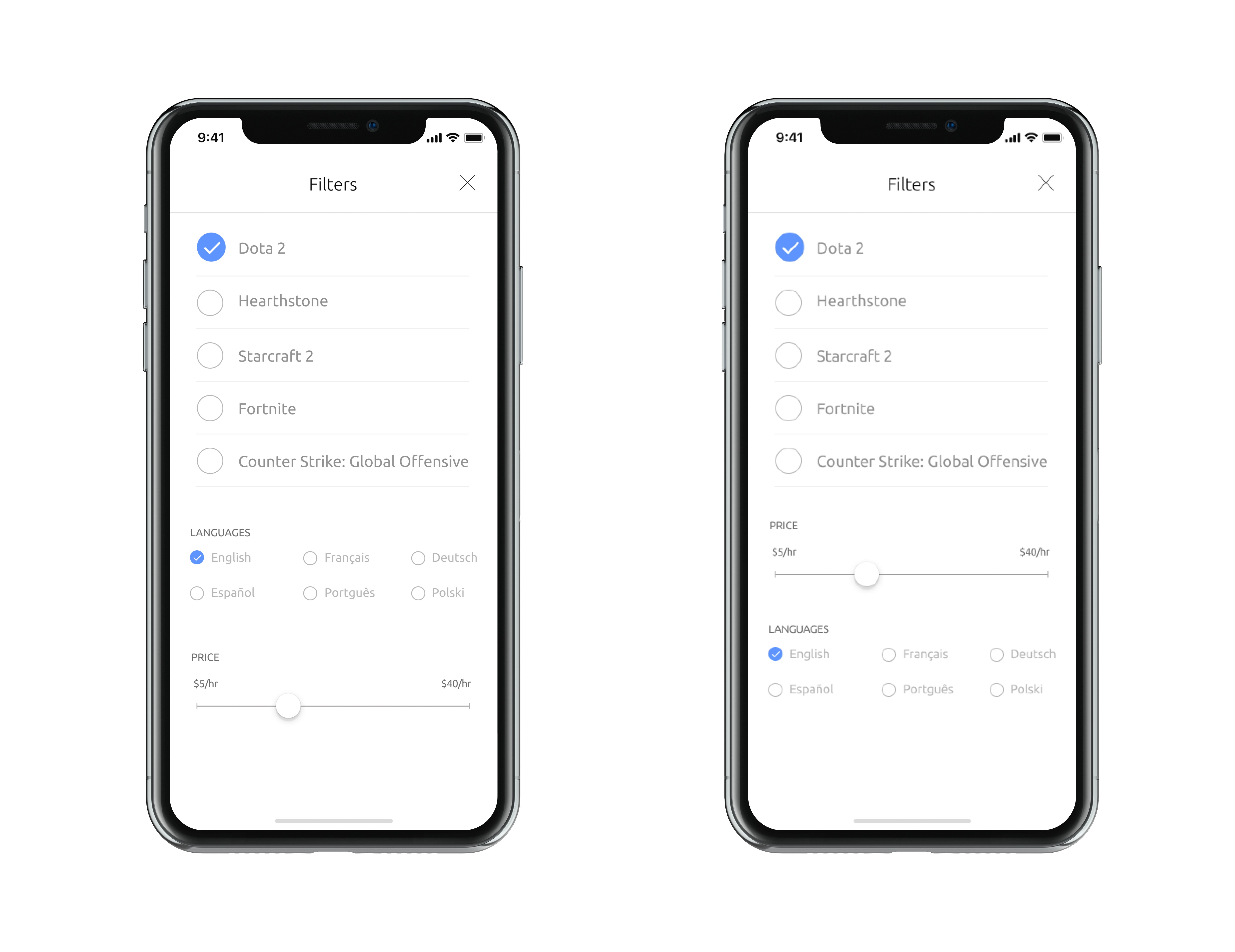
UsabilityHub preference test results: 9 out of 10 participants preferred the left version of the filter screen
Based on usability testing results, I implemented several key improvements:
Introduced coach marks to help users find the scheduling feature in the chat interface.
Refined the filter screen design based on user preferences gathered from the UsabilityHub test.
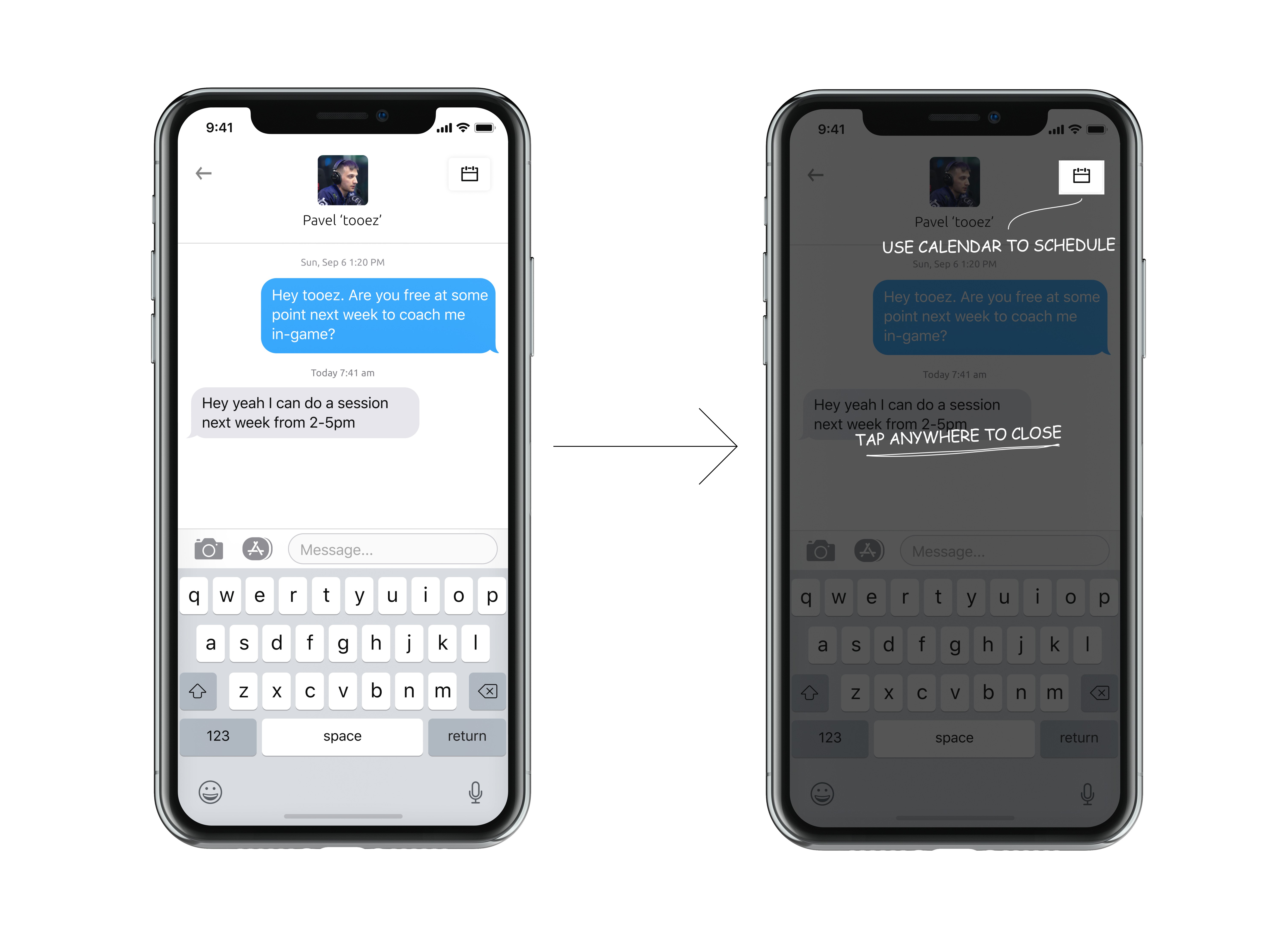
Updated chat screen with onboarding coach marks to guide users to the scheduling feature
4.1
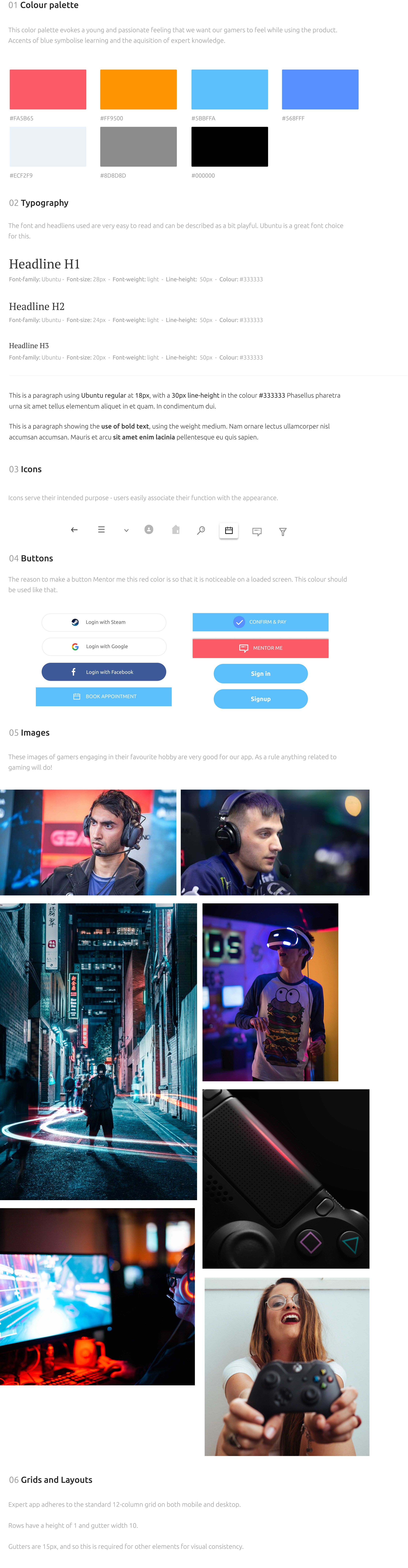
Style Guide
5. What this project demonstrates
Applying user research to define flows and information architecture
Designing mobile interaction patterns for task-focused use cases
Using usability testing to identify issues and iterate designs
This project was completed as part of a bootcamp and reflects exploratory design work rather than a shipped product.